pacman::p_load(tidyverse, cluster , GGally, corrplot, patchwork,
knitr, skimr)Latin American Fintech
1. Load Libraries
The following packages are used:
| Packages | Purpose |
|---|---|
| tidyverse. | Used for data manipulation, transformation, and visualisation. |
| cluster | Used for performing and evaluating cluster analysis. |
| GGally | Used for advanced exploratory data visualisations and variable relationship plots. |
| corrplot | Used for visualising correlation matrices. |
| patchwork | Used for arranging multiple plots into a single layout. |
| knitr | Used for generating reproducible reports by integrating code, output, and text. |
| Skimr | To allow us to get a quite understanding on data. |
2. The Data
This analysis uses the COFINFAD dataset which is a comprehensive 2023 record of Colombian fintech activity.
The data set contains 2 files and only the customer_data.csv is used.
K-means clustering is applied to identify the distinct user profiles to optimize retention and product targeting.
https://doi.org/10.1016/j.dib.2026.112484
2.1 Load Data
The data is first loaded to perform the following checks:
Missing Values: Noted for credit_utilization missing 18k but not dropped since this analysis does not require that.
Data Type are set correctly
Skewness of data and data distribution
customer <- read_csv('Data/customer_data.csv')
skim(customer)| Name | customer |
| Number of rows | 48723 |
| Number of columns | 54 |
| _______________________ | |
| Column type frequency: | |
| character | 13 |
| Date | 5 |
| logical | 7 |
| numeric | 29 |
| ________________________ | |
| Group variables | None |
Variable type: character
| skim_variable | n_missing | complete_rate | min | max | empty | n_unique | whitespace |
|---|---|---|---|---|---|---|---|
| gender | 0 | 1.00 | 4 | 6 | 0 | 3 | 0 |
| location | 0 | 1.00 | 12 | 26 | 0 | 18 | 0 |
| income_bracket | 0 | 1.00 | 3 | 9 | 0 | 4 | 0 |
| occupation | 0 | 1.00 | 4 | 19 | 0 | 35 | 0 |
| education_level | 0 | 1.00 | 3 | 11 | 0 | 4 | 0 |
| marital_status | 0 | 1.00 | 6 | 8 | 0 | 4 | 0 |
| acquisition_channel | 0 | 1.00 | 7 | 11 | 0 | 4 | 0 |
| customer_segment | 0 | 1.00 | 5 | 10 | 0 | 4 | 0 |
| feedback_sentiment | 0 | 1.00 | 7 | 8 | 0 | 3 | 0 |
| feature_requests | 16115 | 0.67 | 13 | 47 | 0 | 25 | 0 |
| complaint_topics | 24346 | 0.50 | 4 | 18 | 0 | 5 | 0 |
| clv_segment | 0 | 1.00 | 4 | 8 | 0 | 4 | 0 |
| preferred_transaction_type | 0 | 1.00 | 7 | 10 | 0 | 4 | 0 |
Variable type: Date
| skim_variable | n_missing | complete_rate | min | max | median | n_unique |
|---|---|---|---|---|---|---|
| first_tx | 0 | 1 | 2023-01-04 | 2023-08-10 | 2023-01-14 | 180 |
| last_tx | 0 | 1 | 2023-05-11 | 2023-12-29 | 2023-12-19 | 174 |
| last_survey_date | 0 | 1 | 2023-01-01 | 2023-12-31 | 2023-07-03 | 365 |
| last_transaction_date | 0 | 1 | 2023-05-11 | 2023-12-29 | 2023-12-19 | 174 |
| first_transaction_date | 0 | 1 | 2023-01-04 | 2023-08-10 | 2023-01-14 | 180 |
Variable type: logical
| skim_variable | n_missing | complete_rate | mean | count |
|---|---|---|---|---|
| savings_account | 0 | 1 | 0.79 | TRU: 38459, FAL: 10264 |
| credit_card | 0 | 1 | 0.63 | TRU: 30460, FAL: 18263 |
| personal_loan | 0 | 1 | 0.32 | FAL: 33321, TRU: 15402 |
| investment_account | 0 | 1 | 0.43 | FAL: 27985, TRU: 20738 |
| insurance_product | 0 | 1 | 0.21 | FAL: 38388, TRU: 10335 |
| bill_payment_user | 0 | 1 | 0.70 | TRU: 34170, FAL: 14553 |
| auto_savings_enabled | 0 | 1 | 0.40 | FAL: 29173, TRU: 19550 |
Variable type: numeric
| skim_variable | n_missing | complete_rate | mean | sd | p0 | p25 | p50 | p75 | p100 | hist |
|---|---|---|---|---|---|---|---|---|---|---|
| customer_id | 0 | 1.00 | 55027986.01 | 2.592111e+07 | 10000617.00 | 32708345.50 | 55174470.00 | 77242332.00 | 9.999980e+07 | ▇▇▇▇▇ |
| age | 0 | 1.00 | 44.54 | 1.228000e+01 | 29.00 | 30.00 | 45.00 | 59.00 | 6.000000e+01 | ▇▁▇▁▇ |
| household_size | 0 | 1.00 | 3.50 | 1.580000e+00 | 1.00 | 2.00 | 3.00 | 4.00 | 1.300000e+01 | ▇▅▂▁▁ |
| active_products | 0 | 1.00 | 2.10 | 1.180000e+00 | 1.00 | 1.00 | 2.00 | 3.00 | 5.000000e+00 | ▇▆▃▂▁ |
| app_logins_frequency | 0 | 1.00 | 22.38 | 1.175000e+01 | 4.00 | 15.00 | 22.00 | 30.00 | 1.000000e+02 | ▇▅▁▁▁ |
| feature_usage_diversity | 0 | 1.00 | 2.37 | 1.740000e+00 | 0.00 | 1.00 | 2.00 | 4.00 | 1.000000e+01 | ▇▅▂▁▁ |
| credit_utilization_ratio | 18263 | 0.63 | 0.29 | 1.600000e-01 | 0.00 | 0.16 | 0.27 | 0.39 | 9.400000e-01 | ▆▇▅▁▁ |
| international_transactions | 0 | 1.00 | 0.49 | 7.000000e-01 | 0.00 | 0.00 | 0.00 | 1.00 | 6.000000e+00 | ▇▁▁▁▁ |
| failed_transactions | 0 | 1.00 | 0.20 | 4.400000e-01 | 0.00 | 0.00 | 0.00 | 0.00 | 4.000000e+00 | ▇▂▁▁▁ |
| tx_count | 0 | 1.00 | 64.84 | 6.119300e+02 | 10.00 | 12.00 | 18.00 | 35.00 | 7.746500e+04 | ▇▁▁▁▁ |
| avg_tx_value | 0 | 1.00 | 3564851.69 | 3.959443e+06 | 318215.00 | 1339114.49 | 1763107.41 | 4658536.36 | 5.167030e+07 | ▇▁▁▁▁ |
| total_tx_volume | 0 | 1.00 | 257472847.91 | 6.211110e+09 | 3182150.00 | 20158450.00 | 48081150.00 | 120445000.00 | 1.073087e+12 | ▇▁▁▁▁ |
| base_satisfaction | 0 | 1.00 | 8.00 | 1.000000e+00 | 4.25 | 7.33 | 8.01 | 8.68 | 1.194000e+01 | ▁▃▇▂▁ |
| tx_satisfaction | 0 | 1.00 | 0.18 | 2.200000e-01 | 0.05 | 0.06 | 0.09 | 0.17 | 1.000000e+00 | ▇▁▁▁▁ |
| product_satisfaction | 0 | 1.00 | 0.47 | 2.300000e-01 | 0.00 | 0.40 | 0.40 | 0.60 | 1.000000e+00 | ▆▇▇▃▁ |
| satisfaction_score | 0 | 1.00 | 4.16 | 5.800000e-01 | 2.00 | 4.00 | 4.00 | 5.00 | 6.000000e+00 | ▁▁▇▃▁ |
| nps_score | 0 | 1.00 | -26.76 | 1.256000e+01 | -80.00 | -34.00 | -28.00 | -19.00 | 2.300000e+01 | ▁▂▇▃▁ |
| support_tickets_count | 0 | 1.00 | 1.00 | 1.000000e+00 | 0.00 | 0.00 | 1.00 | 2.00 | 7.000000e+00 | ▇▂▁▁▁ |
| resolved_tickets_ratio | 0 | 1.00 | 0.51 | 4.800000e-01 | 0.00 | 0.00 | 0.50 | 1.00 | 1.000000e+00 | ▇▁▁▁▇ |
| app_store_rating | 0 | 1.00 | 4.16 | 5.900000e-01 | 2.00 | 4.00 | 4.00 | 4.50 | 5.000000e+00 | ▁▁▃▆▇ |
| monthly_transaction_count | 0 | 1.00 | 5.77 | 5.097000e+01 | 1.00 | 1.60 | 2.00 | 3.09 | 6.455420e+03 | ▇▁▁▁▁ |
| average_transaction_value | 0 | 1.00 | 3564851.69 | 3.959443e+06 | 318215.00 | 1339114.49 | 1763107.41 | 4658536.36 | 5.167030e+07 | ▇▁▁▁▁ |
| total_transaction_volume | 0 | 1.00 | 257472847.91 | 6.211110e+09 | 3182150.00 | 20158450.00 | 48081150.00 | 120445000.00 | 1.073087e+12 | ▇▁▁▁▁ |
| transaction_frequency | 0 | 1.00 | 0.19 | 1.700000e+00 | 0.03 | 0.04 | 0.06 | 0.10 | 2.157800e+02 | ▇▁▁▁▁ |
| weekend_transaction_ratio | 0 | 1.00 | 0.28 | 1.000000e-01 | 0.00 | 0.21 | 0.28 | 0.34 | 9.100000e-01 | ▂▇▂▁▁ |
| avg_daily_transactions | 0 | 1.00 | 0.19 | 1.700000e+00 | 0.03 | 0.04 | 0.06 | 0.10 | 2.157800e+02 | ▇▁▁▁▁ |
| customer_tenure | 0 | 1.00 | 11.37 | 7.200000e-01 | 4.70 | 11.17 | 11.63 | 11.87 | 1.197000e+01 | ▁▁▁▁▇ |
| churn_probability | 0 | 1.00 | 0.34 | 7.000000e-02 | 0.11 | 0.30 | 0.35 | 0.39 | 5.000000e-01 | ▁▂▆▇▂ |
| customer_lifetime_value | 0 | 1.00 | 328159670.79 | 7.926224e+08 | 0.00 | 58414383.33 | 129681954.23 | 297355900.21 | 1.776860e+10 | ▇▁▁▁▁ |
2.2 Data Prep
2.2.1 Feature selection & Scaling
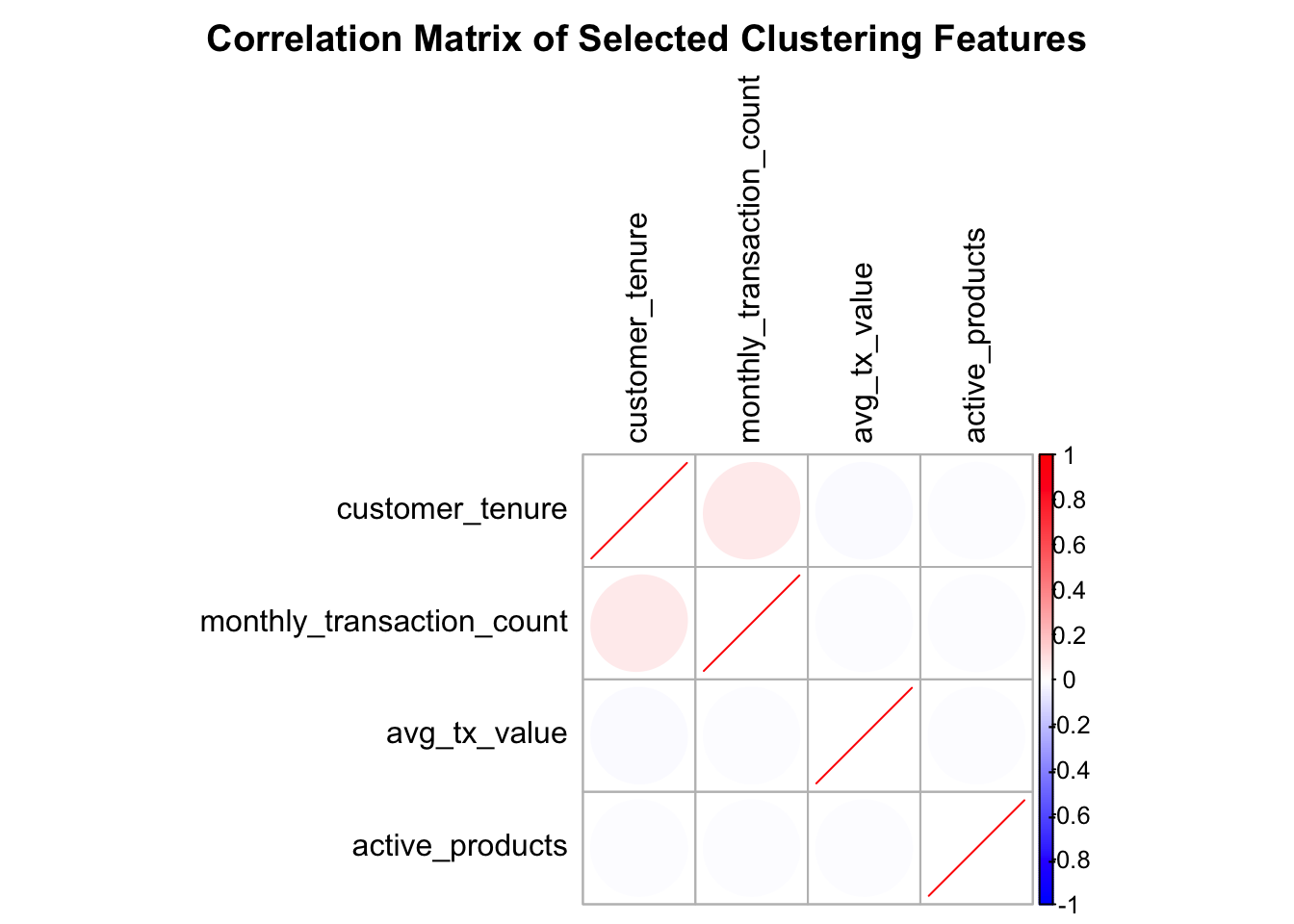
The variables selected for K-means clustering were chosen to minimise redundancy by ensuring that no pair of variables exhibits a high correlation (greater than 0.8).
These four variables were retained because they provide a balanced representation of key customer behaviours that are likely to differentiate customer segments.
The features are then scales to prevent the bigger numbers to dominate the clustering.
Features selected:
transaction intensity: monthly_transaction_count
monetary value: avg_tx_value
product breadth: active_products
relationship maturity: customer_tenure
Code
features <- c("monthly_transaction_count",
         "avg_tx_value",
         "active_products",
         "customer_tenure")

fin.data <- customer %>%
  select(all_of(features))

scaled_features <- scale(fin.data)

fin.cor <- cor(fin.data, use = "complete.obs")

corrplot(
  fin.cor,
  method = "ellipse",
  order = "AOE",
  col = colorRampPalette(c("blue", "white", "red"))(200),
  tl.col = "black",
  title = "Correlation Matrix of Selected Clustering Features",
  mar = c(0, 0, 2, 0)
  )
3 The Model
3.1 Feeding the model
3.1.1 Running the Elbow Plot
The elbow plot is run to allow use to narrow down to the number of cluster that potentially give us the better separation.
Code
# set up no. of max clusters to run
n = 4
n_perf = 10
# Create empty list
wcss <- numeric(n)

# Create loop and extract SSW into list
set.seed(888)
for (k in 1:n_perf) {
  km <- kmeans(scaled_features, centers = k, nstart = 10,
                       iter.max = 200, algorithm = "Lloyd")
  wcss[k] <- km$tot.withinss
}

plot(1:n_perf, wcss, type = "b",
     xlab = "Number of Clusters",
     ylab = "Within Cluster SSE",
     main = "Elbow Plot of K-Means Clustering")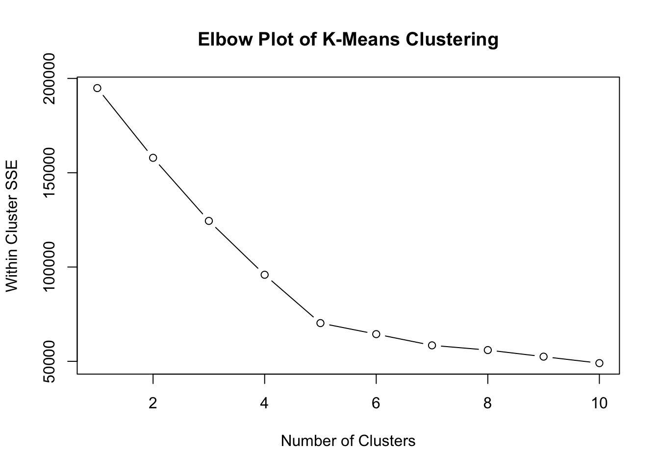
3.1.2 Running the Kmeans model
From the elbow plot the ideal number of clusters are set to be between 3-5.
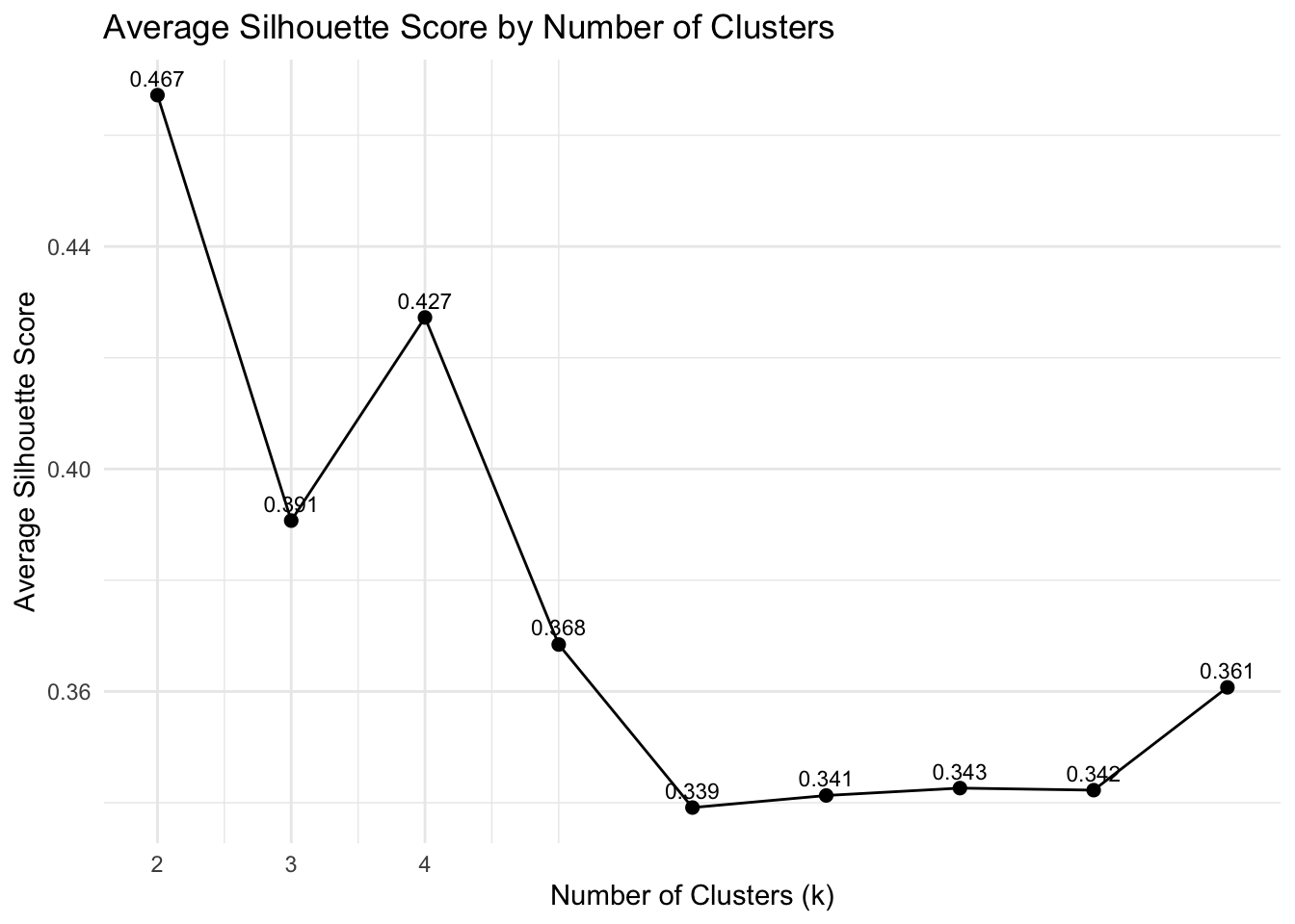
Although k = 5 produced a slightly higher silhouette score, the fifth cluster contained only 24 observations, indicating poor stability. Therefore k = 4 was selected as it provides a balance between cluster quality and interpretability.
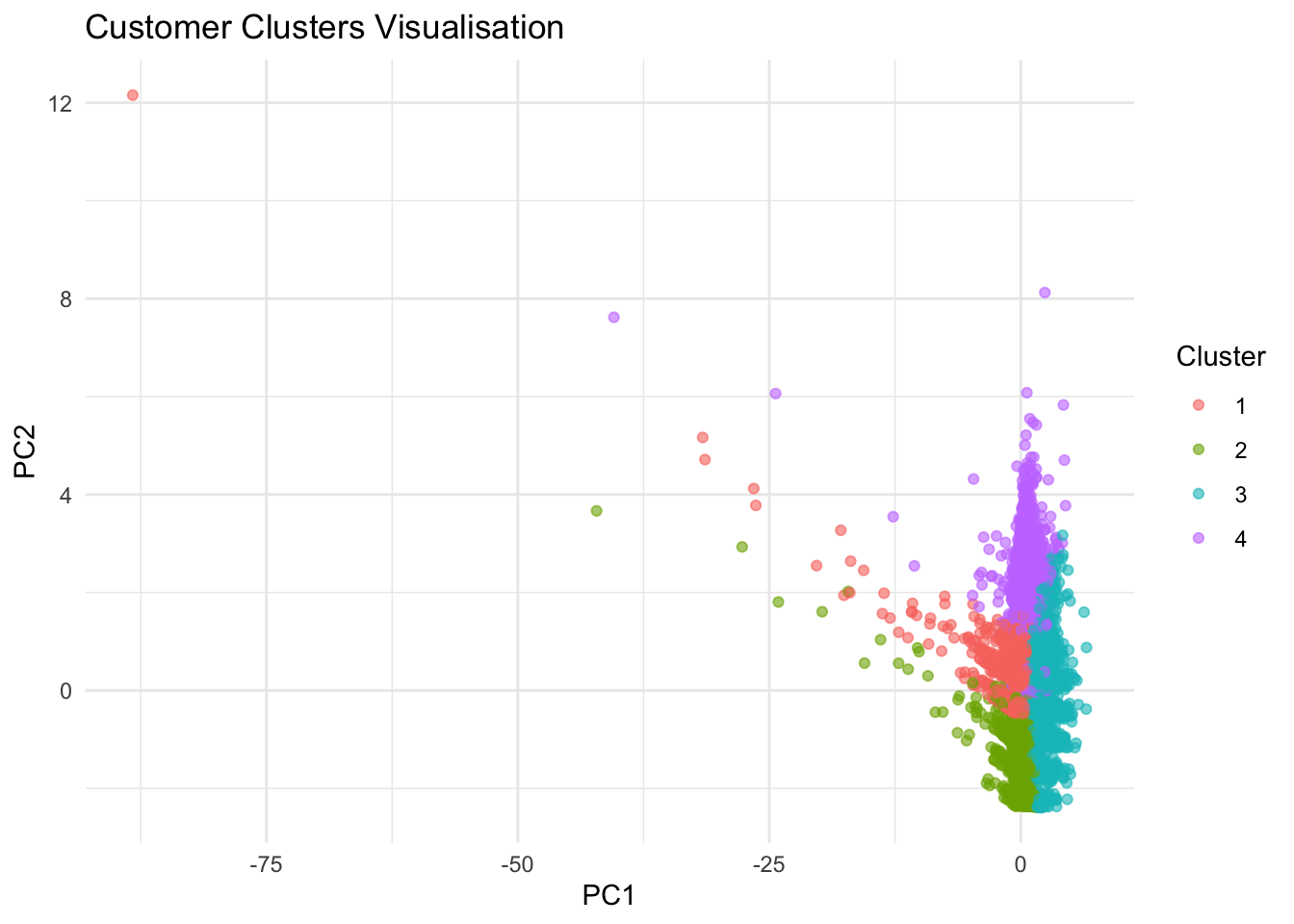
PCA was not used in model construction in order to preserve direct interpretability of the original features. This was only applied separately as a visualisation tool to project the clustered customers into two dimensions below.
We are using Lloyd algorithm as it is more stable for larger data-set.
Code
# Run k means based on n clusters

# Run k means based on n clusters
kmeans_model <- kmeans(scaled_features, centers = n, nstart = 25,
                       iter.max = 200, algorithm = "Lloyd")

# Assign labels back to original data
customer$cluster <- factor(kmeans_model$cluster)

# Assign cluster to count size to prevent shifting
cluster_order <- customer %>%
  count(cluster) %>%
  arrange(desc(n)) %>%
  mutate(new_cluster = row_number())

customer <- customer %>%
  left_join(cluster_order %>% select(cluster, new_cluster),
            by = "cluster") %>%
  mutate(cluster = factor(new_cluster)) %>%
  select(-new_cluster)
4 Performance Evaluation
Overall Performance Summary:
| K Clusters | Silhouette | Variance Explained |
|---|---|---|
| 3 | 0.3907 | 0.36 |
| 4 | 0.4272 | 0.49 |
| 5* | 0.4308 | 0.64 |
*Cluster of 5 is not selected as the 5th cluster is only with 24 members which is too small.
4.1 Silhouette
Silhouette measures how well each observation fits within its assigned cluster as compare to other clusters.
Silhouette value is between -1 and 1.
• Close to 1 → well separated
• Around 0 → overlapping clusters
• Negative → likely misclassified
Code
sil <- silhouette(kmeans_model$cluster,
                  dist(scaled_features))

cat("Silouette:", mean(sil[,"sil_width"]))
Silouette: 0.4272407Code
dist_mat <- dist(scaled_features)

sil_summary <- map_dfr(2:n_perf, function(k) {
  set.seed(888)
  km <- kmeans(scaled_features, centers = k, nstart = 10)

  sil <- silhouette(km$cluster, dist_mat)

  tibble(
    k = k,
    avg_silhouette = mean(sil[, 3])
  )
})

ggplot(sil_summary, aes(x = k, y = avg_silhouette)) +
  geom_line() +
  geom_point(size = 2) +
  geom_text(aes(label = round(avg_silhouette, 3)),
            vjust = -0.6, size = 3) +
  scale_x_continuous(breaks = 2:n) +
  theme_minimal() +
  labs(
    title = "Average Silhouette Score by Number of Clusters",
    x = "Number of Clusters (k)",
    y = "Average Silhouette Score"
  )
4.2 Variance Explained
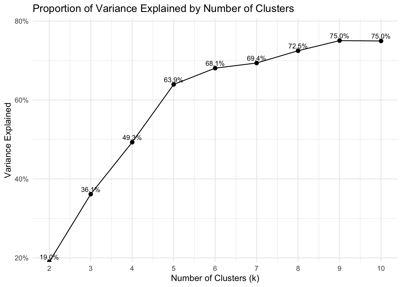
The proportion of variance explained is computed as the ratio of between-cluster sum of squares to total sum of squares.
Variance explained measures the proportion of total variation in the dataset that is captured by the clustering structure.
The value ranges from 0 to 1, where higher values indicate greater separation between clusters.
Clusters Distributions
Code
# Calculate number of observations in each cluster.
cluster_size <- table(customer$cluster)
cluster_size
    1     2     3     4
26486 11910  5756  4571
Code
# Calculate between-cluster Sum of Squares
btwn_clus <- kmeans_model$betweenss

# Calculate total Sum of Squares
tss <- kmeans_model$totss

# Proportion of total variance explained by clustering
var_exp <- (kmeans_model$betweenss / kmeans_model$totss)

cat(sprintf("Between-cluster SS: %.2f\n", btwn_clus))
Between-cluster SS: 96082.95Code
cat(sprintf("Total SE: %.2f\n", tss))Total SE: 194888.00Code
cat(sprintf("Proportion of variance explained: %.2f\n", var_exp))Proportion of variance explained: 0.49Code
var_summary <- map_dfr(2:n_perf, function(k) {
  set.seed(123)
  km <- kmeans(scaled_features, centers = k, nstart = 25,
               iter.max = 200, algorithm = "Lloyd")

  tibble(
    k = k,
    var_explained = km$betweenss / km$totss
  )
})

ggplot(var_summary, aes(x = k, y = var_explained)) +
  geom_line() +
  geom_point(size = 2) +
  geom_text(aes(label = scales::percent(var_explained, accuracy = 0.1)),
            vjust = -0.5, size = 3) +
  scale_x_continuous(breaks = 2:n_perf) +
  scale_y_continuous(labels = scales::percent,
                     expand = expansion(mult = c(0, 0.1))) +
  theme_minimal() +
  labs(
    title = "Proportion of Variance Explained by Number of Clusters",
    x = "Number of Clusters (k)",
    y = "Variance Explained"
  )
5 The Clusters
5.1 Cluster size
4 clusters were selected as:
It is able to explain the variance as compared to 5 clusters
The feature are more differentiated
Code
cluster_size <- customer %>%
  count(cluster) %>%
  mutate(pct = n / sum(n))

p1 <- ggplot(cluster_size,
       aes(x = cluster, y = n, fill = cluster)) +
  geom_col() +
  scale_fill_brewer(palette = "Set2") +
  geom_text(
    aes(label = scales::percent(pct, accuracy = 0.1)),
    vjust = -0.3
  ) +
  theme_minimal() +
  labs(title = "Number of Customers by Cluster",
       x = "Cluster",
       y = "Customers")

p1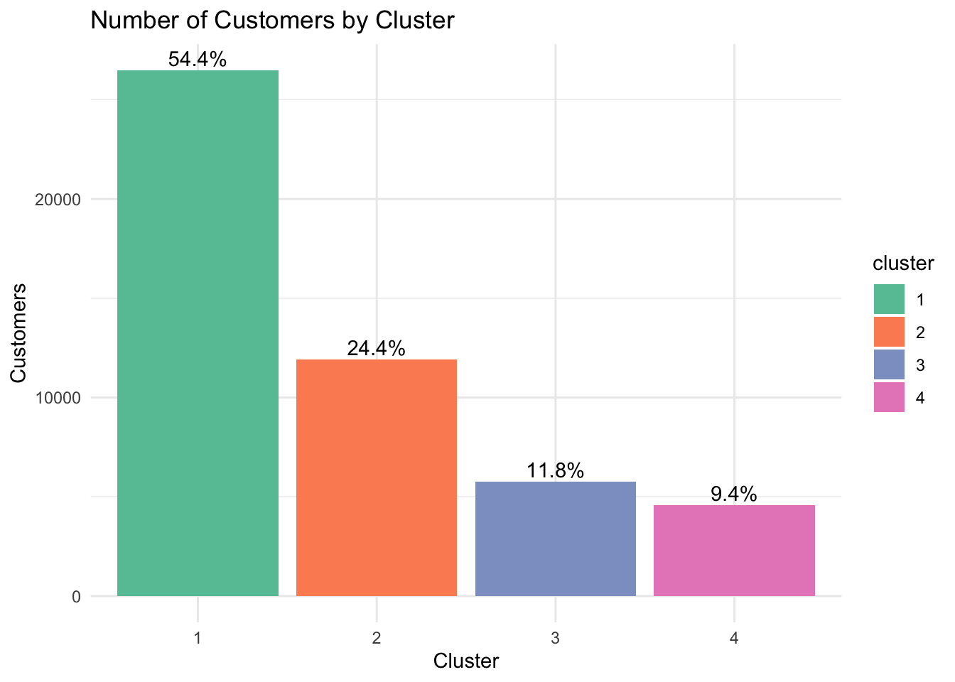
PCA was used as a visualisation tool to project the clustered customers into two dimensions to better visualise the separation and overlap between clusters.
(Note that PCA was not used to build the clustering model, it provides a useful visual summary of the segmentation structure.)
Code
cluster_data <- customer %>%
  select(all_of(features))

# scale data
cluster_scaled <- scale(cluster_data)

# run PCA (Only for visualisation)
pca_res <- prcomp(cluster_scaled)

# Plot prep
pca_df <- as.data.frame(pca_res$x[, 1:2])
pca_df$cluster <- customer$cluster

# ploting the cluster
ggplot(pca_df, aes(x = PC1, y = PC2, color = cluster)) +
  geom_point(alpha = 0.6) +
  theme_minimal() +
  labs(
    title = "Customer Clusters Visualisation",
    x = "PC1",
    y = "PC2",
    color = "Cluster"
  )
5.2 Cluster Characteristics
5.2.1 Parallel plot
Code
# Group of feature mean by clusters
cluster_mean <- customer %>%
  group_by(cluster) %>%
  summarise(across(c(all_of(features)),
                   mean))

# Plot parallel plot
p2 <- ggparcoord(cluster_mean,
           columns = 2:ncol(cluster_mean),
           groupColumn = "cluster",
           scale = "uniminmax") +
  geom_line(linewidth = 1.5) +
  geom_point(size = 2) +
  labs(title = "Parallel plot by clusters mean") +
  scale_color_brewer(palette = "Set2", guide = guide_legend(reverse = FALSE))+
  theme_minimal()


p2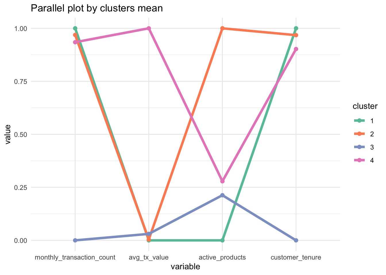
5.2.2 Boxplot of Selected features
Code
customer_piv <- customer %>%
  select(cluster,
         all_of(features)) %>%
  pivot_longer(-cluster,
               names_to = "feature",
               values_to = "value")

p3 <- ggplot(customer_piv,
       aes(x = cluster,
           y = value,
           fill = cluster)) +
  geom_boxplot() +
  facet_wrap(~ feature,
             scales = "free_y") +
  scale_fill_brewer(palette = "Set2") +
  theme_minimal() +
  labs(title = "Cluster Profiles Across Features",
       x = "Cluster",
       y = "Value")

p3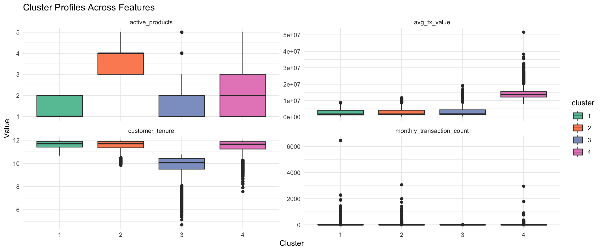
5.2.3 Median by Cluster Group
Code
cluster_median <- customer %>%
  group_by(cluster) %>%
  summarise(across(all_of(features), median))

cluster_median %>%
kable(caption = "Median Feature Values by Cluster")| cluster | monthly_transaction_count | avg_tx_value | active_products | customer_tenure |
|---|---|---|---|---|
| 1 | 2.100000 | 1675191 | 1 | 11.70000 |
| 2 | 2.095455 | 1678361 | 4 | 11.70000 |
| 3 | 1.666667 | 1725881 | 2 | 10.06667 |
| 4 | 2.000000 | 13719926 | 2 | 11.63333 |
5.2.4 Detailed Cluster Comparison
The clusters can be differentiated by the characteristics below:
| Cluster | Segment Type | Characteristics |
|---|---|---|
| 1 | Active Low Value and Long Term Customer |
|
| 2 | Multi-product Low Value and Long Term Customer |
|
| 3 | New and Low Value Customer |
|
| 4 | Premium Customer: Moderately Active and High Value |
|
5.3 Clusters Summary
The Key features for the cluster can be summarised by the Heatmap:
Code
# Normalise fetaure to scale of 0 to 1
cluster_normalised <- cluster_median %>%
  mutate(across(-cluster, ~ (. - min(.)) / (max(.) - min(.))))

# Make tabular format
cluster_long <- cluster_normalised %>%
  pivot_longer(-cluster,
               names_to = "feature",
               values_to = "value")


ggplot(cluster_long,
       aes(x = feature,
           y = cluster,
           fill = value)) +
  geom_tile(color = "white") +
  scale_fill_gradientn(
    colours = c("#e5f5f9", "#99d8c9", "#2ca25f")
  )+
  theme_minimal() +
  labs(title = "Cluster Feature Heatmap",
       x = "Customer Behaviour Features",
       y = "Cluster",
       fill = "Relative Intensity")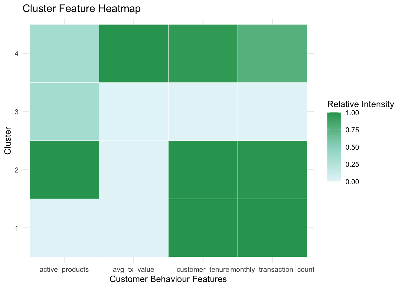
The 4 clusters are summarized as below:
Cluster 1: Active Low Value and Long Term Customer
Cluster 2: Multi-product Low Value and Long Term Customer
Cluster 3: New and Low Value Customer
Cluster 4: Premium Customer: Moderately Active and High Value
6 Deep Dive into Clusters
This section provides a deeper cluster-level interpretation by comparing variables not used in the clustering model. The aim is to assess whether the identified customer segments also exhibit meaningful differences in retention risk, product ownership patterns, satisfaction, and app usage behaviour.
Code
customer %>%
  group_by(cluster) %>%
  summarise(
    mean_churn = mean(churn_probability, na.rm = TRUE),
    mean_satisfaction = mean(satisfaction_score, na.rm = TRUE),
    mean_logins = mean(app_logins_frequency, na.rm = TRUE),
    failed_rate = mean(failed_transactions > 0, na.rm = TRUE)
  )
# A tibble: 4 × 5
cluster mean_churn mean_satisfaction mean_logins failed_rate
<fct> <dbl> <dbl> <dbl> <dbl>
1 1 0.377 4.16 22.4 0.180
2 2 0.263 4.16 22.3 0.182
3 3 0.353 4.16 22.3 0.184
4 4 0.344 4.16 22.6 0.1806.1 Cluster vs Churn Probability
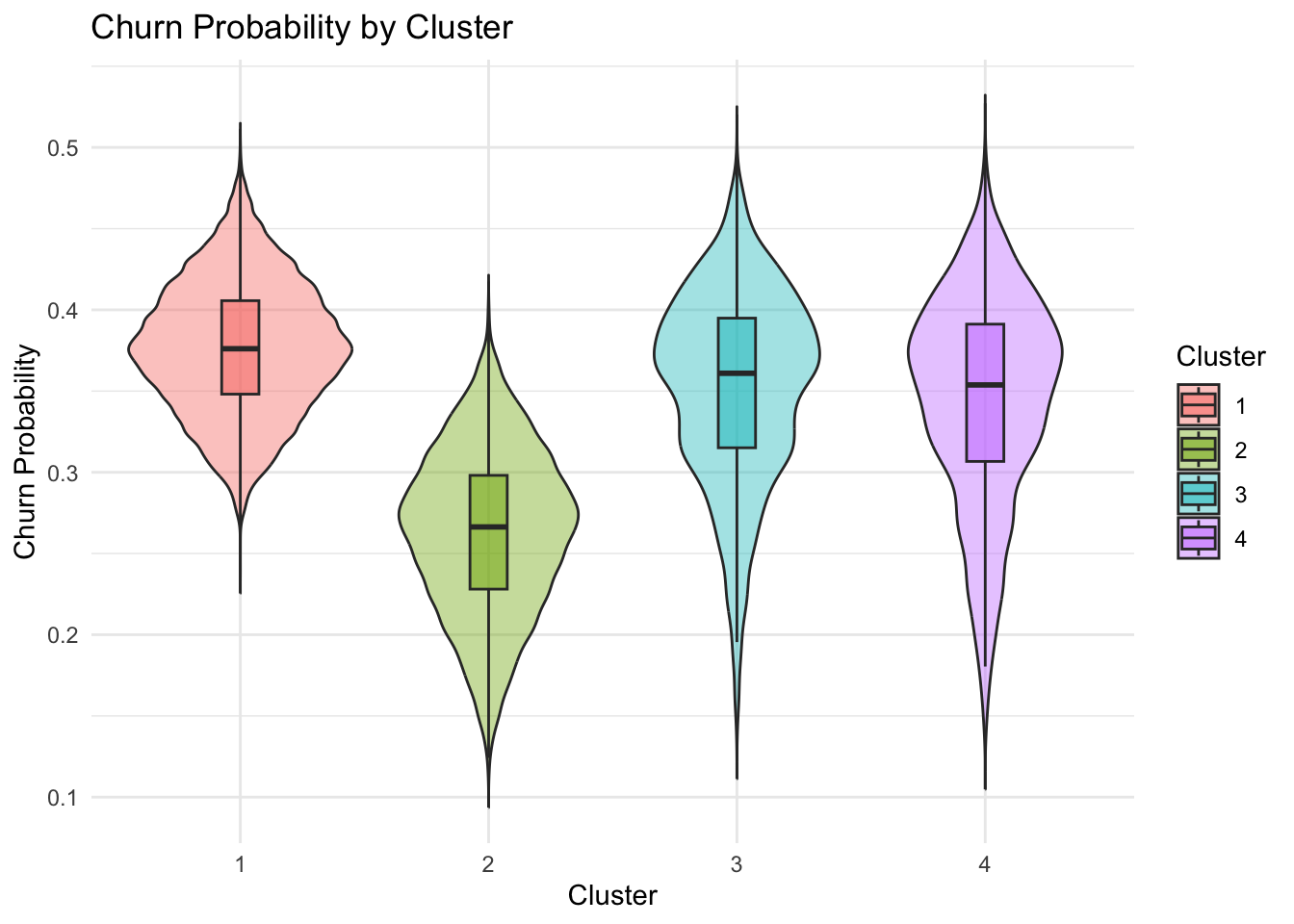
Cluster 2 give the lowest churn probability, while Clusters 1, 3, and 4 show higher and similar churn risk. This suggests that churn probability is one of the more informative variables for distinguishing the customer segments.
Code
ggplot(customer, aes(x = cluster, y = churn_probability, fill = cluster)) +
  geom_violin(alpha = 0.4, trim = FALSE) +
  geom_boxplot(width = 0.15, outlier.shape = NA, alpha = 0.5) +
  theme_minimal() +
  labs(
    title = "Churn Probability by Cluster",
    x = "Cluster",
    y = "Churn Probability",
    fill = "Cluster"
  )
6.2 Cluster vs Product Ownership
Product ownership rate was used instead of raw count to account for differences in cluster size. This allows a fairer comparison of how common each product is within each customer segment.
Based on the observation, the product ownership are rather evenly distributed across the clusters.
Products in scope:
savings_account
credit_card
personal_loan
investment_account
insurance_product
Code
# Creating tabular format for banking product
product_df <- customer %>%
  select(cluster, savings_account, credit_card, personal_loan,
         investment_account, insurance_product) %>%
  pivot_longer(cols = -cluster,
    names_to = "product",
    values_to = "Products_owned"
  )

# Calculate product ownership rate within each cluster
product_summary <- product_df %>%
  group_by(cluster, product) %>%
  summarise(ownership_rate = mean(Products_owned, na.rm = TRUE),
    .groups = "drop"
  )

product_summary <- product_summary %>%
  mutate(product = recode(product,
    savings_account = "Savings Account",
    credit_card = "Credit Card",
    personal_loan = "Personal Loan",
    investment_account = "Investment Account",
    insurance_product = "Insurance"
  ))

p4 <- ggplot(product_summary, aes(x = product, y = ownership_rate, fill = product)) +
  geom_col() +
  geom_text(aes(label = scales::percent(ownership_rate, accuracy = 1)),
            vjust = -0.3, size = 3) +
  facet_wrap(~ cluster) +
  theme_minimal() +
  labs(
    title = "Product Ownership Rate by Cluster",
    x = "Product",
    y = "Ownership Rate") +
  scale_y_continuous(labels = scales::percent) +
  theme(axis.text.x = element_text(angle = 45, hjust = 1),
        legend.position = "none")+
  scale_fill_brewer(palette = "Set2")

p5 <- ggplot(product_summary, aes(x = product, y = cluster, fill = ownership_rate))+
  geom_tile(color = "white") +
  geom_text(aes(label = scales::percent(ownership_rate, accuracy = 1)), size = 3) +
  scale_fill_gradient(low = "grey90", high = "steelblue") +
  theme_minimal() +
  labs(
    title = "Product Ownership Rate by Cluster",
    x = "Product",
    y = "Cluster",
    fill = "Ownership Rate"
  ) +
  theme(axis.text.x = element_text(angle = 45, hjust = 1))

p4/p5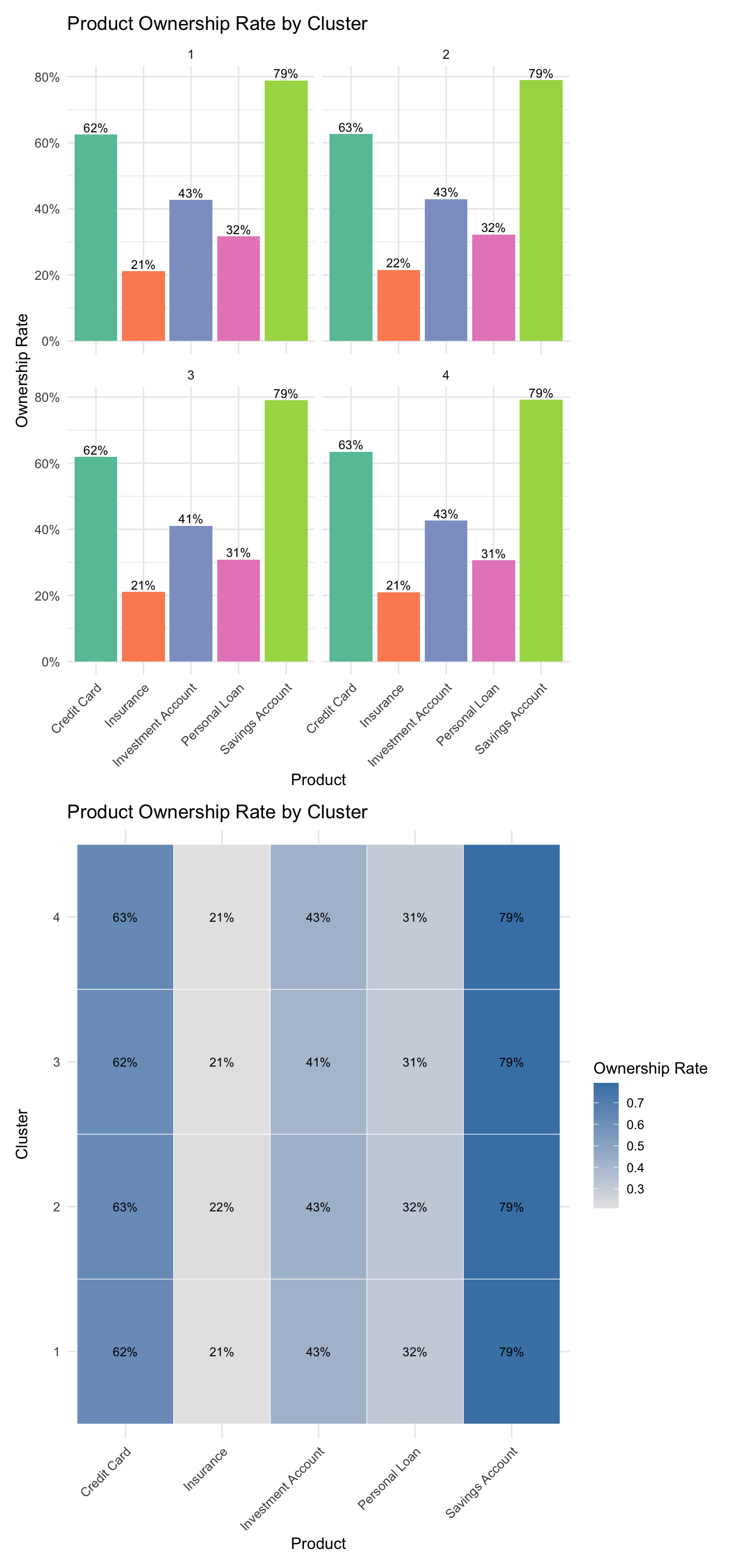
6.3 Satisfaction Score by Cluster
The satisfaction scores are highly similar across all clusters, indicating that satisfaction is not a particularly useful variable for distinguishing or interpreting these customer segments.
Code
# create average satisfaction
mean_df <- customer %>%
  group_by(cluster) %>%
  summarise(avg_satisfaction = mean(satisfaction_score, na.rm = TRUE))


ggplot(customer, aes(x = cluster, y = satisfaction_score, fill = cluster)) +
  geom_violin(alpha = 0.5, trim = FALSE) +
  geom_point(data = mean_df,
    aes(x = cluster, y = avg_satisfaction),
    color = "blue",
    size = 3,
    inherit.aes = FALSE) +

  geom_text(data = mean_df,
  aes(x = cluster, y = avg_satisfaction,
      label = paste0("Mean = ", round(avg_satisfaction, 2))),
  color = "blue",
  vjust = -1,
  size = 3,
  inherit.aes = FALSE) +

  theme_minimal() +

  labs(
    title = "Distribution of Satisfaction Score by Cluster",
    x = "Cluster",
    y = "Satisfaction Score"
  ) +

  scale_fill_brewer(palette = "Set2") +
  theme(legend.position = "none")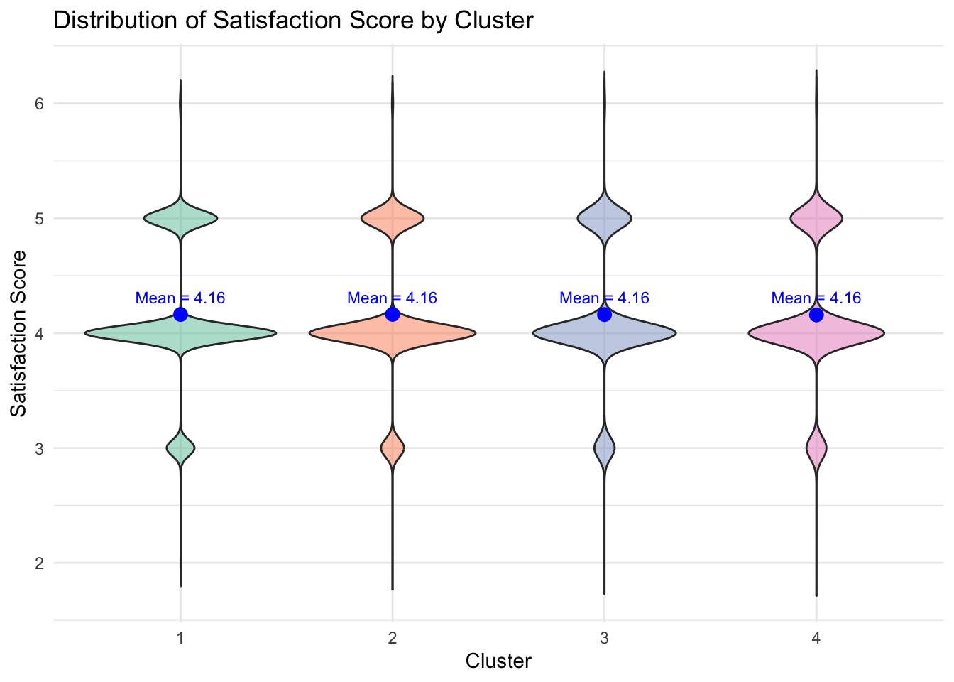
6.4 App Login by Cluster
App login frequency is highly similar across all clusters, suggesting that it is not a particularly useful variable for differentiating or interpreting these customer segments.
ggplot(customer, aes(x = cluster, y = app_logins_frequency, fill = cluster)) +
  geom_boxplot(alpha = 0.7) +
  theme_minimal() +
  labs(
    title = "App Login Frequency by Cluster",
    x = "Cluster",
    y = "App Login Frequency"
  ) +
  scale_fill_brewer(palette = "Set2") +
  theme(legend.position = "none")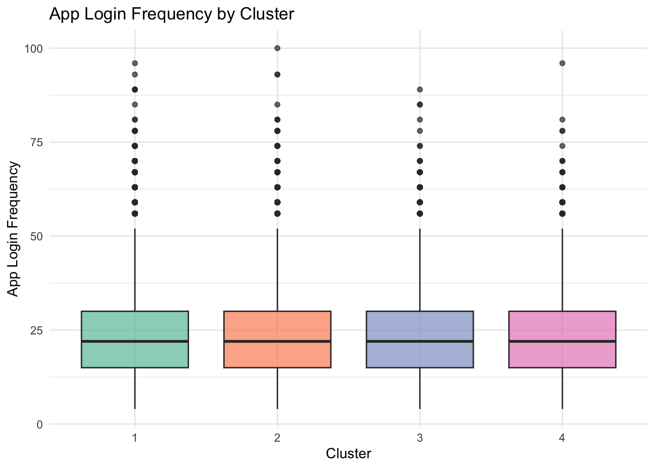
6.5 Deep Dive Summary
customer %>%
  group_by(cluster) %>%
  summarise(
    mean_churn = mean(churn_probability, na.rm = TRUE),
    median_satisfaction = median(satisfaction_score, na.rm = TRUE),
    median_logins = median(app_logins_frequency, na.rm = TRUE)
  )
# A tibble: 4 × 4
cluster mean_churn median_satisfaction median_logins
<fct> <dbl> <dbl> <dbl>
1 1 0.377 4 22
2 2 0.263 4 22
3 3 0.353 4 22
4 4 0.344 4 227 Storyboard for Shiny App module
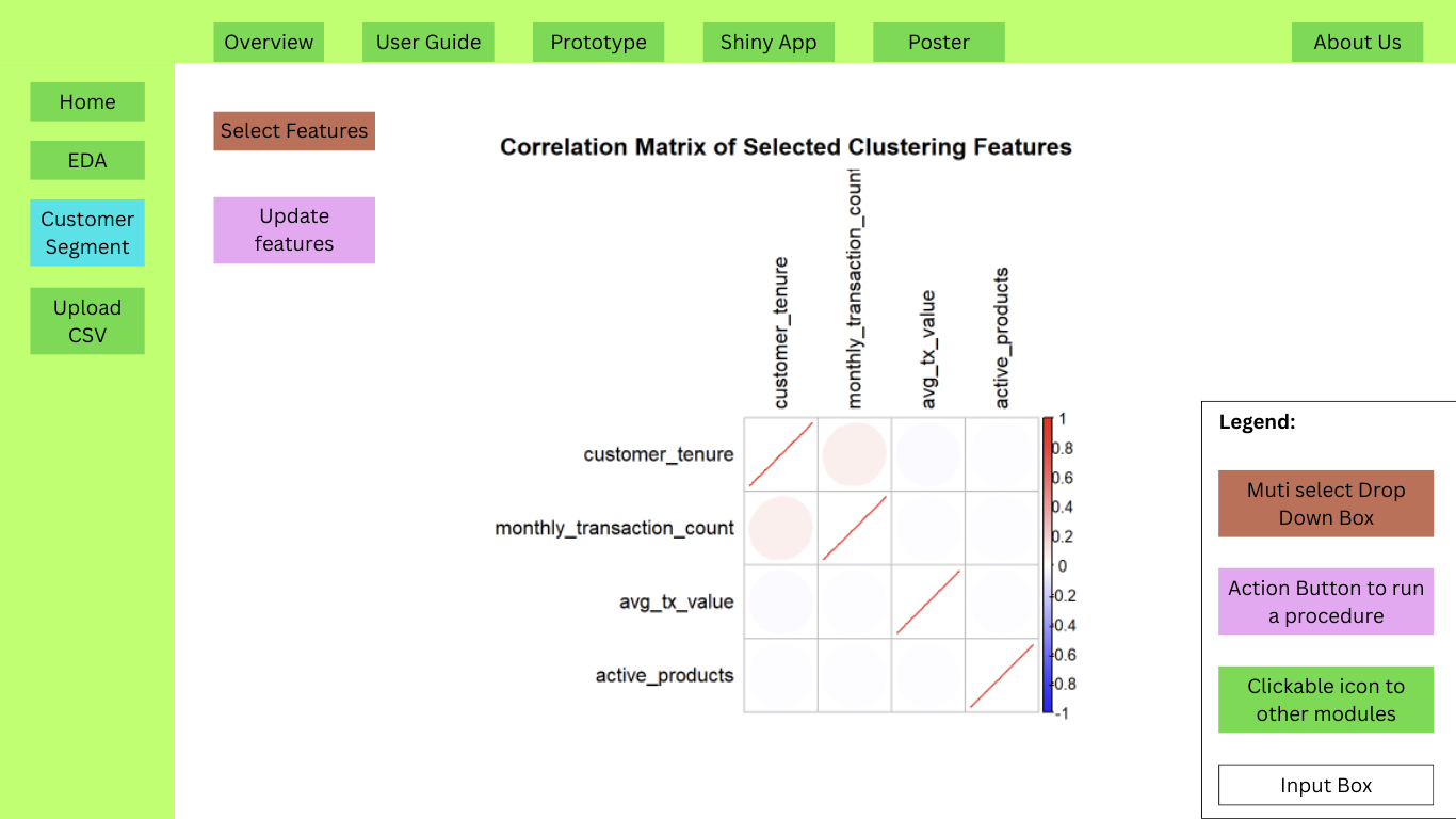
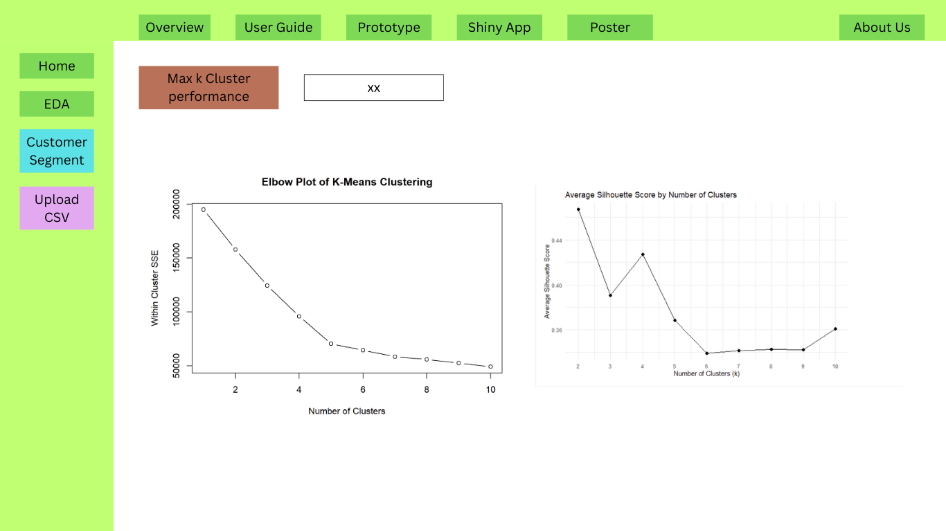
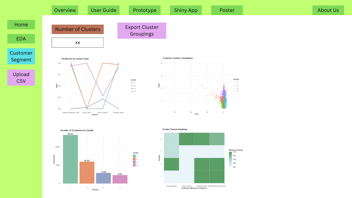
8 References and Inspiration
Kam, Tin Seong. (2025).6 Visual Correlation Analysis – R for Visual Analytics. (2023, December 4). Netlify.app. https://r4va.netlify.app/chap06
Kam, Tin Seong. (2025).15 Visual Multivariate Analysis with Parallel Coordinates Plot – R for Visual Analytics. (2023, December 4). Netlify.app. https://r4va.netlify.app/chap15
Kam, Tin Seong. (2025).16 Treemap Visualisation with R – R for Visual Analytics. (2023, December 4). Netlify.app. https://r4va.netlify.app/chap16
Heat map in ggplot2. (2021, November 2). R CHARTS | a Collection of Charts and Graphs Made with the R Programming Language. https://r-charts.com/correlation/heat-map-ggplot2/
Muñoz-Guerrero, L. E., Ceballos, Y. F., & Trejos-Rojas, L. D. (2026). A comprehensive dataset of customer behavior in Latin American Fintech: 12-month transactional and demographic data for churn analysis. Data in Brief, 65, 112484. https://doi.org/10.1016/j.dib.2026.112484
GeeksforGeeks. (2021, October 13). How To Make Violin Plots with ggplot2 in R? GeeksforGeeks. https://www.geeksforgeeks.org/r-language/how-to-make-violin-plots-with-ggplot2-in-r/